
LETTERS of ARA
An online journal & newsletter, exploring areas of influence & interest for Ara the altar.

Behind the altar | Vol. 2 Making the Braided Grass Ring
Volume 2 of Behind the altar explores the creation of Ritual Object III - The Braided Grass Ring

VOL. 2 —
MAKING THE BRAIDED GRASS RING
Before launching Behind the altar I did an open call to invite suggestions of topics for me to explore as part of this project.
Something that many of you were interested to know more about was the journey a piece of Ara adornment takes from start to finish.
For volume 2, I thought I’d walk you through the creation of the Braided Grass Ring.
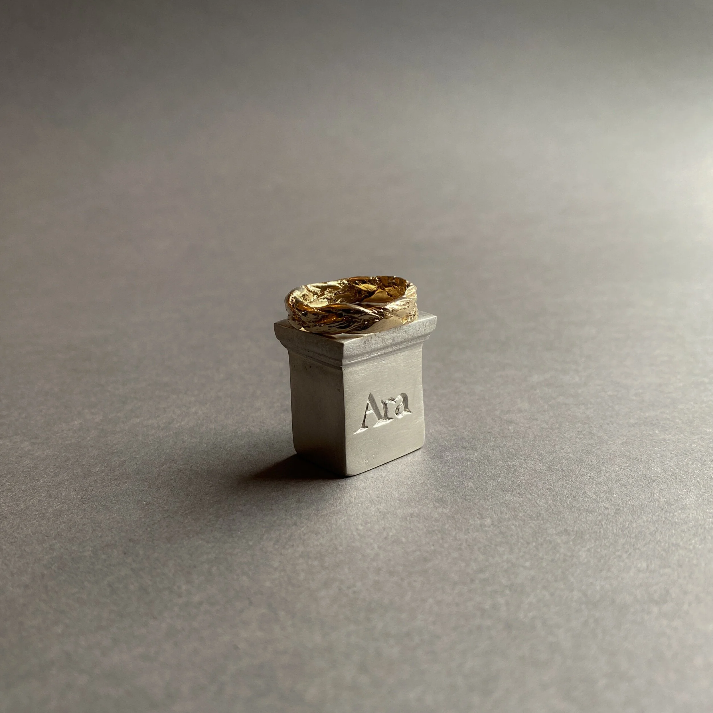
Ritual Object III — The Braided Grass Ring in recycled solid gold

Accompanying props from my recycled gold Phase Fine shoot
THE CONCEPT
—
The idea for the Objects of Ritual family was inspired by a handful of props I used to accompany my recycled gold Phase Fine shoot.
I decided to create a mini collection capturing three objects as wearable sculptures — a collection of protective amulets; miniature sculptures to adorn the body.
One of which was the braided grass ring.

Foraged braided grass, stretched out on my weaving loom and painted with candle wax
CREATING THE ORIGINAL BRAID
—
As this was a sculptural series, working with wax to sculpt and create the objects —to later be cast in recycled solid gold and silver— was the natural fit.
I toyed with the idea of carving the braided grass ring in wax too but I wanted the grass to look as authentic as possible, with the natural imperfections of actual grass.
Instead, I foraged some long grass growing locally and knotted it at one end before braiding the length fairly tightly to get an even braid.
The resulting braid was delicate and hollow with some small gaps — features which would not lend themselves well to the mould making process in which an object is surrounded with melted rubber. The braid would not have withstood the weight of the rubber, and the rubber would also have seeped into the gaps.
In attempt to make the braid more suitable for mould making, I let the braid air dry over several weeks before stretching the length out on my weaving loom and securing it with paper tape.
I gently painted the surface of the braid with melted candle wax, sealing any gaps and making a stronger form to withstand the mould making process. I kept the wax as thin as possible, to retain some of the natural surface texture of the grass.

1/3 of the original braid, ready for moulding
CREATING THE WAX
—
As moulds have a size limit, I carefully cut the braid into three. Each unique in its own form, and long enough to make a ring band. I handed them over to my casting house to have a mould made of each - at that point we were unsure how each of them would translate once cast.
With a successful mould of each, the next step was to inject the mould with wax.

Waxes from the mould
For this step, I measured out and formed the wax into a band shape, to size, and melted each end of the braid together using the flame of my oil burner.
Working away any excess way and smoothing the join so it blends in as much as possible.

A wax braid moulded into a band
LOST WAX CASTING
—
Once happy with the wax, I sent it to my casting house who attach many waxes to a ‘tree’, to cast a full batch in recycled solid 925 sterling silver or recycled 9ct gold.
Over time, once I have made a ring in a particular size, I have a new mould made of the silver ring (which is ideal for mould making), so that future orders in that size can be cast directly by my casting house, without having to send the wax to me to shape into a band. This streamlines the process and helps to minimise carbon footprint.

A freshly cast recycled silver ring with the sprue still on the inside
REFINING AND RESIZING
—
The silver or gold cast band is returned to me with a sprue still attached (where the metal flowed down the tree into the wax ring).
I saw off the sprue, file down any excess metal and then go through a phase of sanding to prepare it for polishing.
I also reshape and resize the ring at this point as the metal shrinks a couple of percent during the casting process.

The band pre re-sizing

In the polishing tumbler, pre-polish
POLISHING
—
Only once the ring has been through every stage of sanding and buffing, I pop it into my polishing tumbler —more fondly known as ‘Celeste’ — with a little castile soap to lubricate the stainless steel shot. I leave the machine on for several hours with a batch of jewellery in it, using electricity powered by 100% renewable energy.
The polishing tumbler works great for pieces like the braided grass ring with texture, but for pieces with a curved or flat surface area that need a mirror polish, I take them though a hand polishing process instead.


The Braided Grass Ring in recycled solid silver
Once out of the polishing tumbler I give the ring a gentle wash with warm water and polish with a soft cloth before tucking her into her hemp pocket to make her journey safely to her forever home.

Packed with a European hemp pocket, naturally dyed by hand
I hope you enjoyed joining the braided grass ring’s journey.
If there’s anything you’d like me to explore as part of Behind the altar, let me know in the comments.
L x

Behind the altar | Vol. 1 Branding
For the first volume of my new project ‘Behind the altar’ I walk through the journey I’ve taken with my branding so far
WELCOME
to
BEHIND THE ALTAR

On the bench — wax work
Welcome to the first volume of my new project, Behind the Altar —
A place to take you behind the altar to explore what really goes on behind the scenes — on the bench, on set, and anything else you’re curious to know.
Expect unpolished content, grubby fingers and a proper peek at what goes into making Ara a responsible brand.

VOL. 1 — BRANDING
For Volume 1, I thought it fitting to return to the beginning of my journey and explore the branding that captures the foundation of Ara in graphic form.
One of the things I love most about managing my own small business is all of the creative aspects I get to play with, a favourite being graphic design.
I am no expert when it comes to graphic design with no training or experience but feeling so close to the brand and it’s portrayal —and launching my brand without any financial support— it was something I was really keen to have a stab at myself.
I thought I’d walk you through the journey I’ve taken with Ara’s branding so far — from where it began to where it is now. You will likely recognise this pool of graphics from across my website, packaging, accompanying cards and stamps, and across platforms — in the content I share on Instagram and in Letters of Ara.

Adding graphic elements to my sample sale imagery
THE SOFTWARE
—
I use Adobe Illustrator for all of my graphic design. Anything from branding to Instagram posts and the monthly graphic illustrations I used to create for Letters of Ara see them here.
This programme gives me scope to create something completely unique to Ara. I pay a monthly subscription which gives me access to other programmes like Photoshop and Lightroom which also enable me to edit all of Ara’s images myself.
Something I’ve found tricky with graphic design is the limitless possibilities it permits. I’m admittedly not the most decisive person and with so many potential design directions to explore, I find it really tempting to explore different avenues and hard to commit to one in particular.
So my main approach is to play. I try and work fairly intuitively and that way I can learn the skills needed for a particular task as I go, rather than feeling overwhelmed to learn everything.
The original logo
WHERE IT BEGAN
—
THE LOGO
In 2017 I sat down with a blank illustrator document and literally wrote the words Ara the altar in about 40 different (but very similar) fonts. I wanted to find just the right fit at this stage to create a logo I could commit to and something I knew I’d love for years to come.
From the offset I had some little hand sketched symbols in mind but when attempting to incorporate them into my logo it just felt too busy. No matter what I tried, I kept coming back to a simple line to separate Ara and the altar. Ara translates from Latin as the altar so this added some distinction as well as visually translating the brand name. I decided to use the sketched element for the line to add a hand drawn aspect to the design.
As various apps and platforms require branding to fit within particular shapes and dimensions, I also needed to create a logo that would fit into a square or a circle. For this, playing around with the original logo layout led me to stack the words in a way that created more of an ‘altar’ structure.
The original square logo

Current branding — a graphic depiction of the brand
WHERE WE ARE NOW
—
In 2018 I introduced something more visual to depict a physical altar and the notion of an ‘offering’ upon it.
The way I approached the design was to think around the the notion of Ara as an altar upon which to offer objects, with a nod to Ara’s core influence — the ancient world’s relationship with astronomy and nature.
This developed into the idea of creating a logo with an altar that could be used alone as a simple graphic but one that could also be added to with interchangeable symbols representing different areas of influence upon the altar.
This finally gave me an excuse to incorporate some of the little symbols I’d developed the first time around — and to play with colour.

Early work in progress developing the altar logo
THE ALTAR
—
I wanted to create an altar that could stand alone as a graphic without the addition of the symbols. Something simple that captured Ara and would be instantly recognisable.
When it comes to the ancient world I’m most closely drawn to Ancient Rome. After researching ancient altars and looking back through images I took when in Rome many moons ago, I worked on and kept tweaking a simple line drawing for the altar, adding the word ‘Ara’ as if it had been carved in stone.
At this point I also played with a dome shaped altar but although I liked it aesthetically it arguably looks more like a gravestone so I stuck with a more literal interpretation of an Ancient Roman altar.
You can see here I also had a brief play with a truncated version of my logo in letter form — the acronym ATA. I had completely forgotten about this and actually really like the shape and symmetry so may return to this at some point. Let me know what you think of ATA.

Early work in progress developing the symbols
THE SYMBOLS
—
When first exploring symbols I had various different elements that I wanted to capture.
Initially for this, the idea was to create a pool of symbols which I could alternate upon the altar.
The more I played with the symbols the more I became drawn to a simpler approach - capturing only two symbols to depict astronomy and nature as the two key influences.
I developed the ‘flora’ symbol to represent nature; a symbol often used in Ancient Rome. To capture astronomy, I combined Luna and Sol to sit above and shine down on the flora offering.

COLOUR
—
As black felt too flat, I use a deep but soft brown (like the earth) as the main colour for my logo.
With the introduction of the graphic depictions, I’ve found these colours have shifted over time, sometimes seasonally and otherwise depending on how I’m using the branding.
I currently have a pool of colours that I pull from but expect this will continue to evolve. Traditionally a brand will have a core set of colours which whilst I do have, I also like the flexibility of allowing these colours to ebb and flow.


I hope you enjoyed this little insight into the thought process behind Ara’s branding. I have a list of topics growing for subjects to explore as part of Behind the altar — if there’s anything you’re curious to know, just let me know.
L x